
Hi friend, I hope this week’s been treating you well so far.
Over the past few days, I’ve been getting outside for long walks and taking more photos of spring around the D.C., Maryland, and Virginia (DMV) area. I’m making the most of the days when I’m not tied to my desk, while still actively searching for my next full-time role.
Before I get into what I really wanted to, let me share my favorite photo from last week, taken at the Netherlands Carillon in Arlington, VA. I love whimsical, dreamy photographs, and this one captures all of that for me.

Photo by Hannah Dormido
1. QGIS
If you know me or if you’ve followed my career, this won’t come as a surprise to you. Unfortunately, I will never shut up about it. 🙂 When I was starting out my cartography journey, I used to call myself a QGIS sorceress in training because it felt like I was learning sorcery. How can all these weirdly-named files turn into a map? I was mindblown.
But I stopped using “sorcery” and “sorceress” because sometimes it backfired on me — some folks would think all I do is click one button and, like magic, a map appears. But I digress. QGIS is free, thanks to the sustaining donor and the community!
Check out my QGIS course on Open Visualization Academy (OVA) if you’d like to learn the basics. OVA is a project by Alberto Cairo, which is a free repository of knowledge for everything and anything information design, data and visualization. More on this in future ChitCharts!
2. RawGraphs.io
I am not the best coder in the world, so I’ve always been using tools to make my process more efficient, especially when I have to respond to breaking news. I really love RawGraphs not only because it is a free, open-source tool, but also because it does not upload your data online.
If you want to learn how to use RawGraphs, you can take my course in OVA. Shout out to the team behind this tool: Density Design Research Lab, Calibro, and Inmagik.
3. Magrit
Another free and open-source tool I use is this web application for mapping. It has a French and English version, so if you end up on the French version, don’t panic. I also don’t speak French, but I love this tool so much.
They have a desktop version if you’d prefer to download it, but I haven’t used it before. Unfortunately, I do not have a course or tutorial for this, but you can check out their site or their GitHub repo. We get to use this tool, thanks to the talented folks at UAR2414 RIATE.
WHO TO FOLLOW 📲
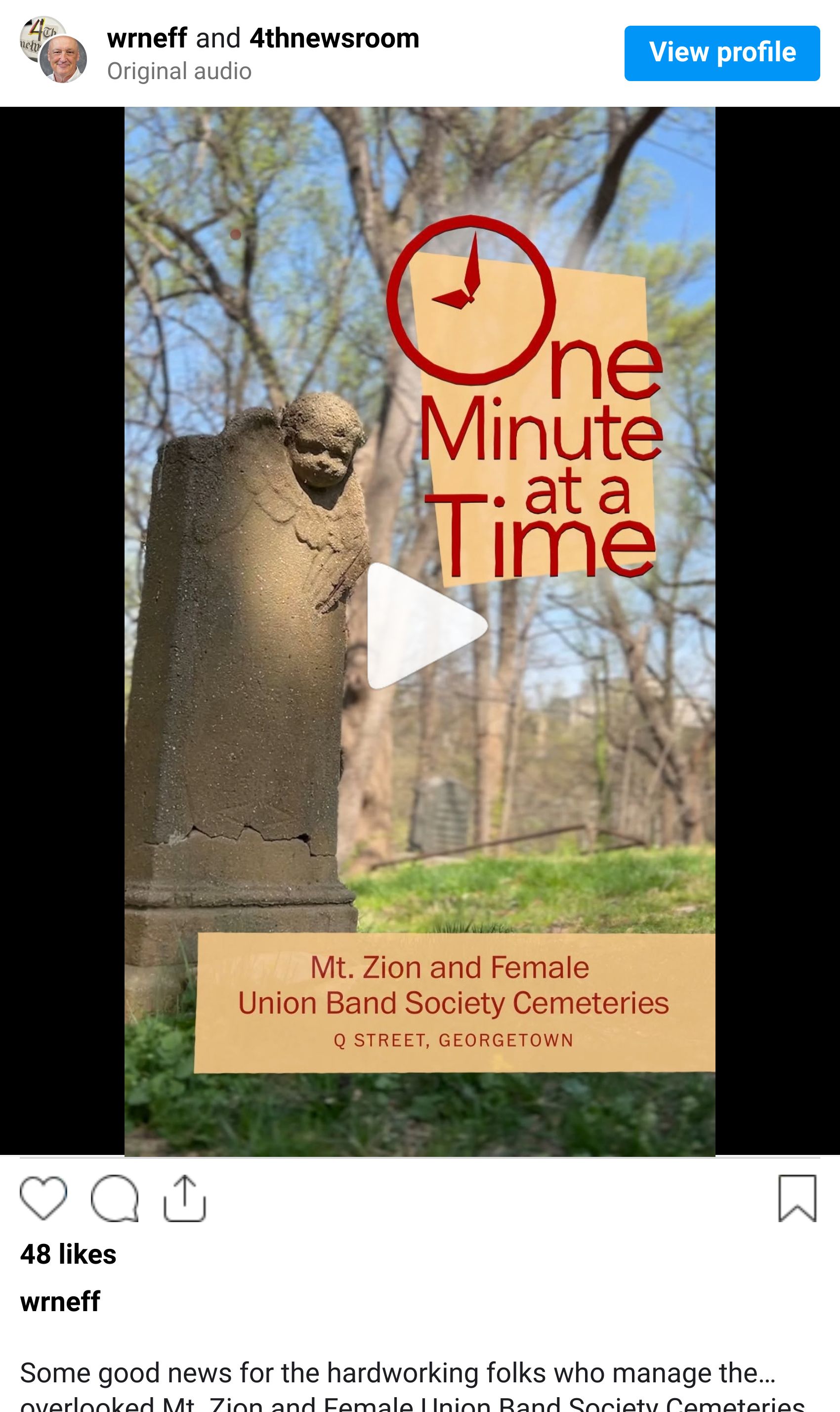
If you’re active on social media and looking for visual storytellers and journalists to follow, I highly recommend One Minute at a Time by my friend and former colleague, graphics extraordinaire William Neff. Each short video offers something new to learn—or a fresh appreciation for DC’s rich history—in just 60 seconds.
CHITCHART MAILBOX 📬
Here we’ll share letters or feedback I receive from friends, with their permission, of course! This is one from a lovely neighbor and friend, Butch, and I would be happy to connect you with him if you’d like to chat.
“I’m retired now, but my career was at the Library of Congress, Copyright Office, Performing Arts section. I watched 35mm feature films and videos and assisted in copyrighting them.
I don’t know if that experience would be helpful to anyone here on Hannah’s ChitChart.”
If you would like to share charts, people, or visual stories that interest you, I would love to hear about them! You can reply to this newsletter or email me at [email protected].
ChitChart soon,
Hannah