
Hi friend, it’s time for ChitChart!
A visual piece that caught my eye recently is Reuters Graphics’ visual story about Chinese fishing fleets near Argentina’s waters. The piece’s sharp, moody, cinematic visuals immediately pulled me in. And to be candid, I did not expect to love this much pink text, but it works.
Check out the story here or their Instagram post below:
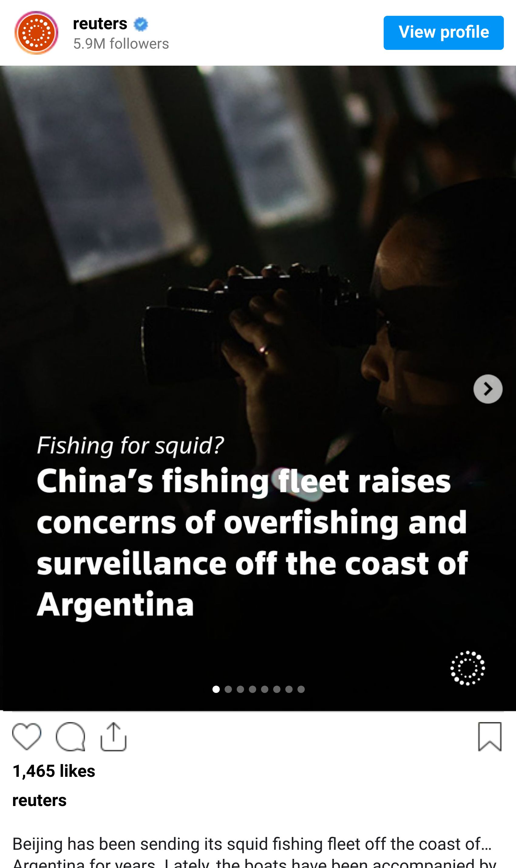
This piece is visually cohesive and beautifully done, but it doesn’t really surprise me. I have been a huge fan of the Reuters Graphics team's visual stories for a while now. In this story, they use photos, maps, and illustrations to help readers understand a complicated ocean story without making it feel overwhelming.
Here are the three things I love about it:

1. The color palette immediately sets the mood.
The visuals lean on deep ocean blues, near-black shadows, and pops of artificial light. Right away, the piece transports us out at sea at night, with only light from other fishing vessels in sight.
I love how it begins above the water, with the night sky and the ships lighting up against the dark ocean. Then, as we scroll, we are slowly pulled underwater into a much darker, quieter space. Even the page background shifts with us, which makes the whole experience feel more immersive.
Those opening visuals are beautiful, but they are also doing real editorial work. They make the scale of the issue feel immediate, urgent, and hard to ignore.
2. The illustrations are beautifully restrained.
The vessel diagram, the squid-catching explanation, and the labeled squid illustration all really stood out to me. For me, they remind me of a field guide: clear lines, helpful labels, and just enough detail to make you want to keep looking.
What I love is that the illustrations are beautiful, but they are not just there to be pretty. They help us understand how everything works — the boats, the lights, the jigs, the squid — without slowing the story down. They make the piece feel more thoughtful, more grounded, and easier to follow.
3. The small details make the story feel real.
A story like this could easily feel far away: fleets, borders, surveillance, and overfishing. But Reuters keeps bringing us back to the details we can actually visualize and understand: the glow of the boats, the gear on board, the way squid are caught, and the photos from the vessels.
That’s what makes the piece work so well. It takes a huge offshore story and gives us small, specific entry points into it. By the end, the issue feels less abstract and much easier to picture.
Why it works
What I love most about this piece is that every visual choice feels intentional. The dark palette sets the mood, the illustrations help explain the process, and the shifts in scale guide us from the vastness of the ocean to the small details of the fishing itself.
I also love that there’s movement on the page, but it never feels like movement for movement’s sake. It’s really easy to fall into the trap of using scrollytelling all the time, and I say that as someone who was absolutely guilty of this in some of my earlier drafts. But over time, I’ve learned that movement and interactivity don’t need to be part of every story.
When they are used, they should add something: clarity, rhythm, emotion, or a better way into the reporting. They shouldn’t be there just because they look cool, even though, let’s be honest, they often do.
That’s what makes this Reuters piece work so well. It is beautiful, but it is also useful. And that balance is what makes the story feel so clear, memorable, and well reported.
WHAT TO READ 📲
Here are three more visual pieces I think are worth your time:
💼 The Washington Post: “7 charts that explain why the job market is so tough right now.”
This one helped me make sense of why the job market feels so weird right now. From far away, things can look steady. But for people trying to get hired, switch jobs, or simply make a move, the experience can feel slow, stuck, and incredibly frustrating.
🗺️ The Guardian: “How rampant violence made Nigeria an insecurity hotspot in the Sahel — mapped.”
A map explainer on how insecurity has spread across Nigeria and why the crisis is getting more attention across the Sahel. I always appreciate it when a map helps untangle a complicated story without making it feel even more overwhelming.
💧 World Bank Data360: “Water Quality: A Foundation for Health and Development”
A thoughtful visual story about safe drinking water: who has access, who doesn’t, and why water quality remains such a difficult problem to solve. It’s the kind of piece that makes a huge global issue feel easier to understand, without losing sight of the people affected by it.
WHAT I’VE BEEN UP TO 🧙🏼♀️
I’ve been lucky to spend time on a couple of projects rooted in storytelling, community, and connection.
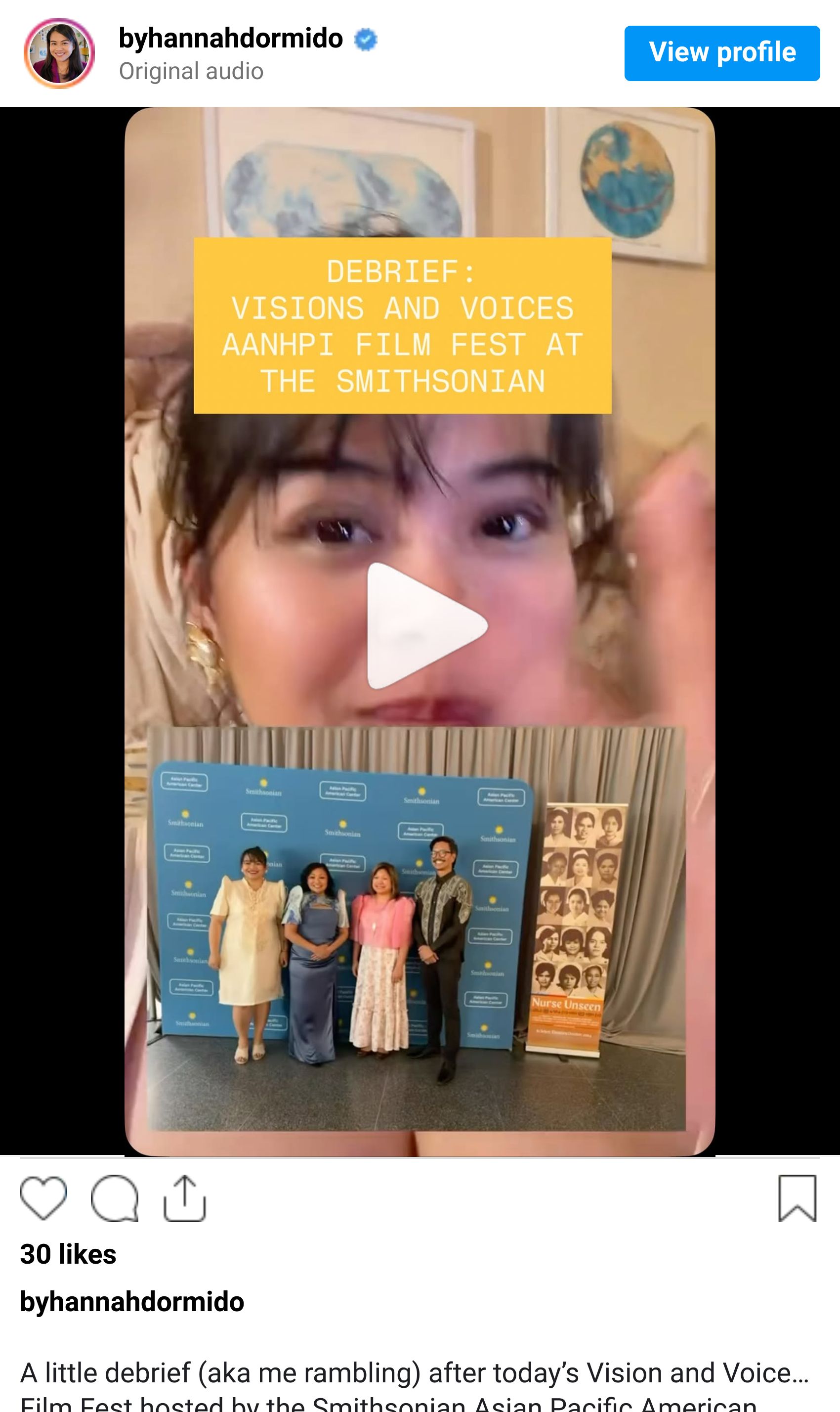
🎤 I had the honor of moderating the panel discussion for Nurse Unseen at the Visions and Voices Film Fest, hosted by the Smithsonian Asian Pacific American Center. It was such a powerful conversation, and I felt grateful to help hold space for it.
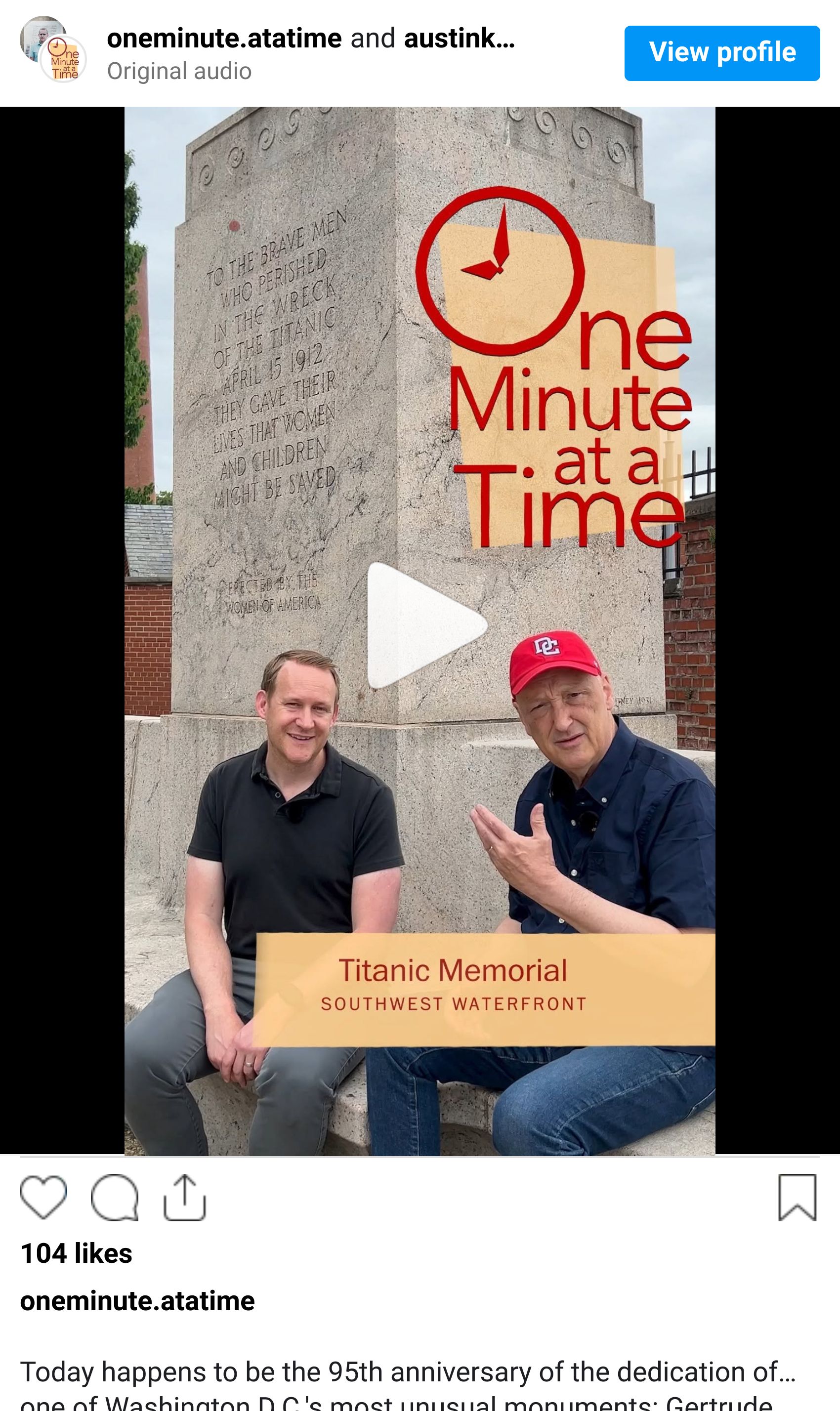
📹 I also filmed with my former Postie colleague and friend, William Neff, for the latest episode of One Minute at a Time, centered on the Titanic Memorial in Washington, D.C. We interviewed another former Postie, Austin Graff, which made the day feel like a sweet little Post reunion.
I hope this week has been kind to you so far and that the short work week is giving you a little extra breathing room.
I’ve been trying to give myself a few days without any plans, which honestly still feels a little strange to me. I’m so used to filling the quiet and finding something to preoccupy my brain — whether that be filming videos for ChitChart, painting, or making leather journals. But lately, I’ve been reminding myself that rest is not something to earn; it’s a blessing, too.
ChitChart soon,
Hannah